The most interesting parts of any house museum, in my opinion, are the service spaces.

Vizcaya was planned primarily around the public and entertaining rooms, which leaves only awkward leftover spaces for the numerous servants which were required in this time period. Oddly enough, the kitchen is on the 2nd floor, not in the basement (but we'll get to that later!).

The first of these service spaces is a cupboard off the dining room (marked passage on the plan above in blue). Functioning as a small butler's pantry, the space also worked as a hall between the
dining room and
tea room so had to be attractive.

The ceiling has a gorgeous painted wood ceiling with painted wood gates hiding the service cupboard which houses china storage and wash-up sink. The gilded English china seen here has an interesting story which I'll talk about at the end of this post. PS: don't you just love these painted wood cabinets?

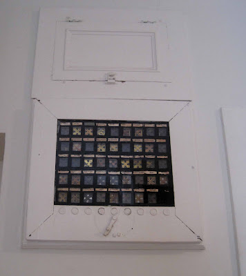
Located on the opposite side of the Tea Room (seen on the plan above in green), the main butler's pantry is larger than most modern household kitchens. The room boasted the most modern of conveniences for the time period, including the electric annunciator panel above which showed where a servant was required when rung for.

Another modern contraption was the master clock, seen behind the cabinets above, which controlled the time on 10 clocks throughout the house (much like many schools have today).

Above you can see the painted door into the tea room. The open countertops have been converted into glassed-in display cases for the many sets of china Vizcaya posesses.

Above is the yacht china which was in Deering's yacht moored at Vizcaya. It bears the New York Yacht Club emblem as well as his own. The china is rimmed in silver to protect it from chipping on bumpy voyages.

The china seen here was ordered by Deering from England for his house in Chicago and was originally brought over, unfortunately, on the Titantic. The china obviously had to be remade and was shipped over a few years later (hand gilding isn't fast!)

By this point Vizcaya had been completed so it was brought here where it remains to this day. The originally ordered china, however, still lies at the bottom of the Atlantic. No word however on whether the White Star Line covered the replacements; does anyone know? Now THATS a story!
 The most interesting parts of any house museum, in my opinion, are the service spaces.
 Vizcaya was planned primarily around the public and entertaining rooms, which leaves only awkward leftover spaces for the numerous servants which were required in this time period. Oddly enough, the kitchen is on the 2nd floor, not in the basement (but we'll get to that later!).
  The first of these service spaces is a cupboard off the dining room (marked passage on the plan above in blue). Functioning as a small butler's pantry, the space also worked as a hall between the dining room and tea room so had to be attractive.
 The ceiling has a gorgeous painted wood ceiling with painted wood gates hiding the service cupboard which houses china storage and wash-up sink. The gilded English china seen here has an interesting story which I'll talk about at the end of this post. PS: don't you just love these painted wood cabinets?
 Located on the opposite side of the Tea Room (seen on the plan above in green), the main butler's pantry is larger than most modern household kitchens. The room boasted the most modern of conveniences for the time period, including the electric annunciator panel above which showed where a servant was required when rung for.
 Another modern contraption was the master clock, seen behind the cabinets above, which controlled the time on 10 clocks throughout the house (much like many schools have today).
 Above you can see the painted door into the tea room. The open countertops have been converted into glassed-in display cases for the many sets of china Vizcaya posesses.
  Above is the yacht china which was in Deering's yacht moored at Vizcaya. It bears the New York Yacht Club emblem as well as his own. The china is rimmed in silver to protect it from chipping on bumpy voyages.
 The china seen here was ordered by Deering from England for his house in Chicago and was originally brought over, unfortunately, on the Titantic. The china obviously had to be remade and was shipped over a few years later (hand gilding isn't fast!)
  Label:
China of the week,
history,
houses,
Interiors,
Vizcaya
 0
komentar

 The Tea Room (or Enclosed Loggia as it was originally known) is probably the most beautiful room in the house, if not in all of Florida! Tooting his own horn, Chalfin himself called it an 'enchanted room'.
 The room was originally furnished with highly colored striped upholstered pieces and small tables on a highly stylized marble mosaic floor made in New York and shipped in pieces. See an older photograph of the space below.
 The wall paintings depict Neapolitan scenery and date to the late 18th century.
  The table above is the only piece of furniture left and is original to the room.
 The gilded wrought-iron gates that lead into the courtyard were bought before the house was designed from the Villa Pisani in Venice.

 Painted creams, pinks and blues, I think the plaster ceiling resembles a piece of delicate Wedgwood.

 The arched gates into the courtyard echo the stained glass nicely.
 Just beyond the
  Continuing the total mix of styles, the music room is a cozy little room straight out of a Venetian palazzo from the mid 18th century, pure frivolity and mood.
 The designer, Chalfin, was said of this mood "Some one seems to lurk here, wearing old creamy satin, looking into dim mirrors at strings of pearls and corals upon a narrow and corseted bosom, ready with facile musical sighs" A tad dramatic maybe but very evocative; it is after all a very dramatic space.
 The walls are paneled with scenes painted on canvas and surrounded with gilded wood moldings, seashells, coral and 18th century Venetian blown glass flowers.


 Scavenged Roman columns again hold torchieres as in the Living room; I like the continuity.
 The ceiling is a copy from the Palazzo Gonzaga in Mantua but the furniture is authentic; ranging from the 15th thru 17th centuries, much of it originating from monasteries.
 While certainly impressive, it's not a very cozy or welcoming room and was rarely used. Rather, Deering preferred to eat al fesco in the courtyard or on the terrace.
 The largest room at Vizcaya is the Living Room - 25' wide and 50' long with ceilings which soar to 20 feet high. This is nearly a double-cube which follows the Renaissance rules of porportioning. The ceilings again are imported from a 16th century Venetian Palazzo but are modified to fit the room.
  Chalfin decorated the room in French Renaissance style, perhaps not the most cozy of styles to select but appropriate for the collections.Originally the room also housed more 'modern' couches for comfort and was not as museum-like as it appears today.
  The tapestry decorates plain plaster walls and dates from the mid 16th century from Ferrara and depicts the labors of Hercules.
 The fence you see helps to protect a valuable heraldic rug woven in the 15th century for the grandfather of King Ferdinand of Spain, an Admiral in the Spanish navy. The flooring underneath is dark terrazzo which is appropriate for the seaside setting.

 The figural top is actually not original but was created by Chalfin's design staff as a sort of finial to complement the chimneypiece.
 After leaving the living room one passes through the East Loggia which faces the bay, opposite the courtyard from the
 The highlight of the space is a 5' long model of a Spanish caravel. Imagine this ship swaying in the bayside breezes when the loggia was open.
 The loggia was originally treated as the outdoor living room and was furnished with comfortable wicker furniture with brightly colored cushions. As it had one of the best views of Biscayne Bay in the house, it's not hard to imagine guests spending the majority of their time here.
 Previous Article
